New
![]() [Photo: Mio]
[Photo: Mio]
![]() [Photo: Mio]
[Photo: Mio]
Mio’s Maximalist Rebrand Speaks To How The Beverage Industry Is Evolving
Plain water might be boring, but liquid beverage company Mio is out to prove to Stanley cup-toting Gen Z “beverage girlies” that they can get more from their water with a splashy, colorful rebrand.
Mio makes its case with simplified packaging, an updated sans-serif typeface, and an eye-catchingly bright color scheme that’s designed to stop scrolls. As part of the rebrand, the company has also adopted a new, TikTok-ified marketing strategy that captures younger consumers by playing into online trends and hashtags.
At its core, the Mio rebrand is a visual manifestation of two major factors that shape Gen Z’s beverage consumption in 2024: a near-obsessive fixation on hydration, and an increasing interest in health and wellness-promoting products.
SO LONG, SODA: FUNCTIONAL BEVERAGES ARE ON THE RISE
Mio, a Kraft Heinz subsidiary, launched in 2011 with flavored liquid drop packs that could upgrade a water bottle without powders—essentially, the grown-up version of the nostalgic Kool-Aid experience. That initial novelty helped it rake in more than $100 million within nine months of launching. Similar products, like Coca-Cola’s Dasani Flavor Drops and the small brand Stur, quickly cropped up. Now, Mio is shifting its positioning to track with the rising market dominance of the “functional beverages” category.
Functional beverages typically advertise some kind of health or mood benefit derived from a particular set of ingredients. Popular prebiotic sodas like Olipop and Poppi fit into this category, as well as adaptogenic drinks like Bella Hadid’s Kin Euphorics. Mio’s caffeinated energy pods, alongside its electrolyte-infused Hydrate line, would also be considered “functional.” Based on data from a study by NielsenIQ, U.S. sales of functional beverages grew 54% to $9.2 billion between March 2020 and March 2024. Safe to say that Mio wants a bigger part of that soda stream.
For Gen Z, hydration is king, as evidenced by even a quick scroll through TikTok. In April 2023, #WaterTok—wherein creators mixed various aesthetic powders and syrups with their water—took off on the app. Top videos have over 3 million views at time of writing.
#Beveragegirly and #beveragegoblin remain popular tags that describe anyone who always keeps a brigade of beverage options nearby. Not to mention the hydration obsession that can be found in the Stanley cup community, where drinking multiple 64-ounce bottles of water per day is child’s play. As Bon Appétit writer Sam Stone put it, “in our endless quest for hydration, we need Water Plus.”
HYDRATION IS A LIFESTYLE, IF YOU BUY INTO IT
Mio’s marketing team kept a close eye on these trends. The company saw notable volume growth when WaterTok started to take off. In 2023 overall, it experienced a 7% increase in sales with consumers under 35. According to Samantha Mills, Mio’s director of brand communications, Gen Z consumers demonstrated a particular interest in Mio’s Energy line, which includes 12 servings of caffeine per bottle. (One squeeze of Mio is enough for a 12 ounce glass of water.)
Now, Mio has overhauled its positioning and brand to capitalize on its growth and tap into Gen Z’s mounting interest in hydration and functional drinks. It’s a noticeable pivot from the 2020 campaign “We Fix Water.” The ad series espoused the idea that regular water is so bland you couldn’t drink it even if stranded at sea (without a few drops of Mio to save the day). The company’s new campaign, “squeeze good in,” emphasizes health and wellness instead.
“This is the first manifestation of that new strategy, going from just being that liquid flavor enhancer, ‘fixing the taste of water,’ to becoming more of this benefit-forward lifestyle brand,” Mills says.
ON SHELF OR ONLINE, MINIMALISM IS NOT THE VIBE
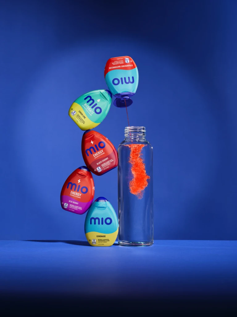
The most noticeable aspect of the Mio rebrand is its new packaging. A pared-down, sans-serif wordmark replaces Mio’s previous logo, a capital “M” with a liquid drop in the center. The change, Mill’s says, was intended to make the brand “more accessible, relaxed, approachable, and familiar.” Other brands, like Eddie Bauer and Johnson & Johnson, have also cited recognizability to younger consumers as a motivation to adopt a simpler wordmark.
Mio cut down the overall copy on the bottles as much as possible. Small icons on the Energy and Hydrate lines call attention to their functional benefits rather than packing the pods with words. Color takes center stage above all. The new brand amps up each flavor combo with a fully neon look that reflects its contents, like teal and chartreuse for lemon lime.
“If we think about Gen Z, minimalism is not their vibe,” Mills says. “They’re all about living life, maximalism, and bright colors.”
Mio is also making a point of meeting younger consumers where they are: TikTok. The company adopted a TikTok-first social media strategy that uses Gen Z lingo and adds a branded twist to current trends (like recreating the viral chocolate-covered strawberry video, though they missed the trend by more than a month).
Mio isn’t the only functional beverage company taking a page out of Gen Z’s maximalist stylebook as of late. The energy drink company Rockstar recently unveiled a vibrant new look, and Liquid I.V. also debuted a visual identity this month that spotlights its functional benefits and flavors.
“[Mio’s rebrand] is a pretty significant departure and evolution of the visual identity, and so as you can imagine, we did test with consumers and do research,” Mills says. “We’re feeling confident that this is going to have a positive impact on driving growth with Gen Z.”