Therapy Isn’t Scary. Just Ask Talkspace’s New Branding
The online therapy company Talkspace just debuted its first rebrand since launching in 2012, and the new look is sending a message: Mental healthcare should feel approachable, not intimidating.
“[The common design tropes in mental healthcare] feel so cold,” says Joe Ling, creative director of the design agency Koto. “Therapy should be warm, it should feel comforting, it should be a soft experience, not something that feels surgical and uncomfortable. A lot of the competitors use that type of imagery, which immediately makes the experience feel a little bit scary.”
Therapy as a habit
As a mental healthcare service, Talkspace wants to help reposition the mainstream idea of therapy away from a crisis intervention tool and toward a habitual practice that’s available for anyone. Talkspace describes its mission as a commitment to “helping people lead healthier, happier lives through access to high-quality mental healthcare”—although the company has weathered its fair share of rough patches in pursuit of that goal. In 2016, an investigative feature from The Verge reported a laundry list of concerns from participating therapists, and a 2020 New York Times article opened up discussion of potential client privacy violations.
Despite these issues, demand for the app rose sharply during the COVID-19 pandemic, when in-person mental health treatment was limited. According to the CDC, interest in mental health treatment generally rose between 2019 and 2021, especially among those aged 18-44. According to Katelyn Watson, chief marketing officer at Talkspace, a main goal of the company’s rebrand is to elevate the voices and faces of Talkspace members, “so anyone can see themselves in therapy.”
“We’ve transformed our brand identity to both reflect and celebrate shifts in the mental health landscape, especially the normalization of therapy and mental health conversations, and the fact that innovation and insurance coverage make quality care more accessible than ever,” Watson said in a press release.
Redesigning online therapy
Before Ling’s team at Koto launched into redesigning Talkspace’s visual identity, they performed an audit of other brands in the mental healthcare sector to identify common patterns. What they found was striking. Certain motifs seemed to be everywhere across the category, including speech bubbles, two clasped hands, people staring into screens, and cold, muted colors. Ling says the combination of these elements could often make platforms seem distant and inauthentic—even reminiscent of a sterile doctor’s office. Further, he says, brands sticking within that design purview would have a difficult time developing equity with consumers.
Ling’s team found that Talkspace’s signature turquoise color scheme is what made it most recognizable. So, they built out a warm new color palette around the hue, incorporating accents like lemon, orange, and maroon.
“We wanted colors that felt a little bit more lifting and optimistic,” Ling says. “The last thing you wanted this to be is really dark and brown—we wanted oranges and yellows that brought a sense of friendliness. We didn’t want it to become this surgical, heavily white, clinical brand.”
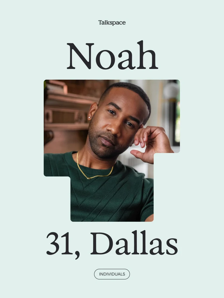
Talkspace’s wordmark and copy got a refresh as well. Koto used the rounded serif font Exposure to give the type an approachable quality, adding a soft yet playful touch through various line weights. They also created a T-shaped brand symbol that’s ubiquitous across the website and marketing assets. It’s a flexible shape that can be adjusted to different dimensions as a tool to frame photos or text while maintaining overall visual cohesion. To emphasize the brand’s focus on authenticity, Koto made a series of cheerful line animations as additional assets and worked with the photographer Tylor Norwood for real-life imagery.
“With stock photos, they feel so fake and inauthentic that people just don’t relate to it,” Ling says. “We wanted to have photos of real users, so people could relate to seeing others like them. I thought that was a great way of making the connection between a potential Talkspace user and someone who might be a little apprehensive about therapy.”
Popular Products
-
 Height Adjustable Electric Chair Lift...
$400.89$299.99 -
 Portable Under Desk Elliptical for Se...
$290.99$202.78 -
 Invisible Rechargeable Hearing Aids w...
$160.99$111.78 -
 Secure Shoe Inserts
$30.99$20.78 -
 Stair Chair Evacuation Wheelchair
$509.99$355.78